Six Observability Lessons from a 1,500-Line Desktop Widget
I built a macOS menu-bar app to watch my two DGX Sparks. It has exactly one user, and that is why it taught me more about observability than most production dashboards: nothing was hidden behind a vendor abstraction. Six numbers on that panel were wrong, and every one of them was wrong for a reason that applies directly to monitoring AI systems in an enterprise. A CPU metric that confidently lied, a read-only connection that silently corrupted its own reading, and four more.
Six Observability Lessons from a 1,500-Line Desktop Widget
I built a small macOS menu-bar app to watch my two DGX Sparks. It has exactly one user: me. That is precisely why it taught me more about observability than most production dashboards I have worked with, because nothing was hidden behind a vendor's abstraction. Every wrong number on that little panel had to be traced back to the line of code that produced it.
Six of those numbers were wrong. Each one was wrong for a reason that applies directly to monitoring AI systems in an enterprise.
The setup
The two machines are called Jean-Luc and Kathryn. They are NVIDIA DGX Spark GB10 boxes, 128 GB of unified memory each, and they run my local AI stack. Naming them after Star Trek captains was not a joke that stayed a joke: the monitoring app became Starfleet Command, and it wears the delta insignia in the menu bar.
Functionally it is unglamorous. Every 5 seconds it opens an SSH connection to each host, runs a Python script there, and gets back one JSON blob: which AI coding sessions are running, RAM and GPU load, temperature, and which models the local inference router currently serves. A checkbox opens a floating desktop panel with the same live data.
That is 1,047 lines of Swift and 439 lines of Python. Small enough to hold in your head, large enough to get six things wrong. The whole thing is public at github.com/pauloesterwitz/Starfleet, including the panel tooling below.
Lesson 1: The metric that lied
My first "is this session busy" indicator was CPU usage per session. It was wrong, and it was confidently wrong: a session I had last touched three hours earlier still displayed as working.
The cause was a fallback I had written myself. The function that maps a session to its operating-system process first looks for a process whose command line contains the session ID. When that fails, it falls back to attributing any matching process running in that session's directory. So several sessions sharing one folder all inherited the CPU of a single active process, and all of them looked busy.
The fix was not a better threshold. It was to stop deriving and start reading.
The session database already knew the answer. Every message row carries a time object in its JSON, and that object only gets a completed key once the message actually finishes. So the ground truth for "still generating right now" is simply: the latest message is from the assistant and has no completed key yet.
generating[sid] = (
    d.get("role") == "assistant"
    and "completed" not in d.get("time", {})
)
One subtlety worth keeping: a dangling last message from the *user* also lacks completed, but that is a different state (waiting for a reply, not generating one). The role check excludes it.
The rule: a metric derived from a guess will report the guess with full confidence. Before you tune a heuristic, look for the field the system itself writes at the moment the thing actually happens.
Lesson 2: The read-only connection that corrupted the reading
The monitoring script only ever issues SELECT statements. So the obviously correct choice is a read-only database connection, right? I tried that first, and removed it.
A strict read-only SQLite connection cannot fully participate in the write-ahead log's shared-memory index. In practice it returned a stale, incomplete view: a session with real task rows read back as all zeros. The safeguard did not fail loudly. It quietly handed me plausible wrong numbers.
A plain connection that only ever reads sees the write-ahead log correctly, and is just as safe in practice.
The rule: a safeguard that degrades correctness silently is worse than no safeguard at all, because it converts a visible outage into bad data that nobody questions. This is the one on this list I would most expect to bite an enterprise monitoring setup, where read-only replicas and restricted service accounts are the default and nobody re-validates what they actually return.
Lesson 3: Not every error is an outage
Kathryn reports an error on every single poll: unable to open database file. Her status light stays green, and that is deliberate.
The app sets a host-level error only from a connection-level failure: SSH refused, a timeout, an expired network authentication. It never sets one from the payload's own error field. The distinction is exactly this:
Kathryn is reachable. The database simply does not exist yet, because that tool is deployed there but not yet used. So the error is rendered as plain informational text next to her live RAM and GPU figures, which are themselves proof the host answered.
The rule: an error *in* the response and a failure to *get* a response are two different events. A monitor that collapses them into one red light cries wolf until people stop looking at it. Half the alert fatigue I have seen in client systems is this single confusion, repeated.
Lesson 4: Address things by identity, never by current location
My SSH config originally pinned each Spark to its raw network IP. That worked beautifully until it did not.
On one specific afternoon I moved the MacBook from home Wi-Fi to a phone hotspot. The mesh VPN reassigned an address, and every alias pinned to the old one broke at the same instant, both hosts at once. From the app's point of view, the entire cluster had vanished.
The fix is the DNS name that always resolves to the device's current address. A bare short hostname is not a safe substitute either, because it races the home router's own local-network answer for the same name.
The rule: anything you pin to a *current* address is a scheduled outage with an unknown date. Pin the name.
Lesson 5: The monitor's topology has to match the system's
Some of my models are tensor-parallel clusters that genuinely occupy both Sparks at once. But the inference router itself runs on only one host.
So the naive question, "which models is this host serving", produces a quietly wrong picture: a cluster model shows up under Jean-Luc alone, while it is demonstrably also running on Kathryn, consuming her memory and her GPU.
The fix has two halves. The script re-reads the router's own routing groups from its config file on every poll, so a model I add to the cluster group later is picked up with nothing to redeploy, and tags each running model as cluster or single-node. The app then folds a cluster-tagged model reported by one host into the other host's display list too, deduplicated by name. A single-node model is never borrowed this way.
This is why Kathryn's "Serving" line can show a model even though her own router is unreachable. It is showing what Jean-Luc reported, for a model that provably also runs on her.
The rule: the machine that answers your query is not necessarily the machine doing the work. Model the real topology, or your dashboard will under-report and you will size your capacity against a fiction.
Lesson 6: The medium overrides your design intent
This one is not about data at all, and it cost me the most time.
The menu-bar label was supposed to show two coloured status dots, one per host. It cannot. Not "with difficulty", not "with a workaround": the platform will not render it.
The macOS menu-bar item renders its label through a template-image pipeline that does two things. It does not reliably rasterize raw vector shape content, silently falling back to a generic placeholder glyph instead of showing anything at all. And it strips custom colours from whatever *does* render. A green filled circle and a colour-tinted system symbol both came out as a flat, system-chosen tint.
So two things changed. The brand mark became a small bundled bitmap rather than a vector redraw. And health status is encoded in glyph choice (a question mark, a warning triangle) rather than colour, because colour is literally not available in that surface.
The coloured dots still exist, in the dropdown and the desktop panel. Those are ordinary application windows, where shapes and colours render normally. Same app, same data, two rendering surfaces with completely different capabilities.
The rule: verify what the target surface can actually render before you design for it. That constraint is not negotiable by effort, and no amount of styling will argue it down.
The third surface, which proves the point
There is a third place the same data goes, and it is the most constrained of all: a small physical panel on my desk.
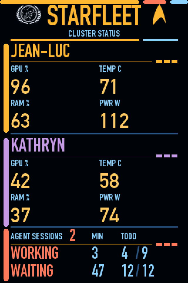
Calling it a display is wrong, and the mistake matters. It is a USB human interface device sensor panel. It exposes no video path at all, it never appears in the operating system's display settings, and that is not a missing driver. It runs at USB 2.0 full speed, roughly 64 kilobytes per second. A single 480 by 320 frame in 16-bit colour is 307 kilobytes, about five seconds per frame. It physically cannot be a screen.
So it does not receive pixels. It stores a compiled theme in its own flash memory, renders that locally, and the host pushes nothing but numeric values on twenty numbered channels. Channel 1 is Jean-Luc's graphics utilisation, channel 5 is Kathryn's, channel 9 is the count of actively generating sessions.
Which produces the sharpest version of everything above:
1 draws the cell containing WORKING.Three surfaces, one set of numbers, and the capability floor drops at every step: a full application window, then a menu-bar label that strips colour and vector art, then a panel that cannot accept an image at all and has to be told everything as bare integers.
Two smaller ones worth keeping
The right tool is sometimes the one with the wrong name. The desktop widget is not a real system widget. Real ones refresh only a few times per hour, which cannot carry a 5-second poll and a 90-second stall detection. So it is a plain always-on-top panel that shares the same poller. Pick your component by its refresh contract, not by its product category.
A rename is a new identity. Renaming the app changed its bundle identifier, and macOS treated it as a genuinely different application. Notification permission and the launch-at-login registration both had to be re-confirmed, and the saved panel position reset to defaults, orphaned under the old identifier rather than deleted. Identity is a key, not a label. The same is true of every entity ID you have ever renamed in an ERP system.
The one heuristic I left as a heuristic
Not everything resolved into ground truth. "Stalled" is still a guess: the process is alive, its CPU is idle, the database has not been touched for more than 90 seconds, and there are still open tasks. There is no real "waiting for permission" flag to read anywhere.
So I left the threshold as a named constant at the top of the file, rather than burying it inside a condition:
STALE_SECS = 90The honest treatment of a heuristic is to label it as one and leave the adjustment knob somewhere it can be found. A heuristic disguised as a measurement is how a dashboard loses the trust of the people reading it.
Monitoring is not collecting data
There is one root under all six failures, and it is not technical. In every case a number reached the panel before I had asked what it would actually tell me. Processor load was there because processor load is easy to read, not because I had decided that "busy" was the thing I needed to know.
That is the same failure I see in client systems, different only in scale. Monitoring gets treated as a deliverable, so a dashboard is built, and it fills up with whatever is cheapest to collect rather than what is worth knowing. Cheapest-to-collect is exactly where derived proxies live, which is exactly where the lies are.
The test I use now is one question per number: what decision changes if this moves? If nothing changes, the number is decoration. Decoration is not harmless. It dilutes attention across a wall of readings that nobody has any reason to trust, so on the day a real one turns red, nobody reacts to it.
I would rather have four metrics I can trace to the line of code that produces them than forty that merely look thorough. A key performance indicator that exists because somebody decided it had to be measured is not a measurement, it is an obligation someone discharged.
Monitoring is not collecting data. It is gaining knowledge from data. Everything above is just the six specific ways I managed to forget that.
Why a toy taught this at all
None of these six lessons is exotic. Every one of them is a well-known observability principle. I knew all of them in the abstract before I started.
What I did not have was the experience of watching each one fail on a system small enough that I could see the whole thing. In a production monitoring stack, a metric derived from a bad fallback is invisible. It looks like data. Nobody digs into the function that produced it, because there are two hundred other metrics and none of them are anyone's job specifically.
On a panel with four numbers on it, a lie is obvious within a day. That is the entire value of building the small version first.
If you are standing up monitoring for an AI system, whether that is an agent fleet, a RAG pipeline, or an inference cluster, my one suggestion is this: for every metric on the dashboard, find the exact line that produces it and ask what happens when its assumption is false. Six times out of six, that question was the whole job.
The code, the panel tooling and the channel map are all on GitHub: github.com/pauloesterwitz/Starfleet.

Paul Oesterwitz
AI & SAP Consultant · PhD Researcher